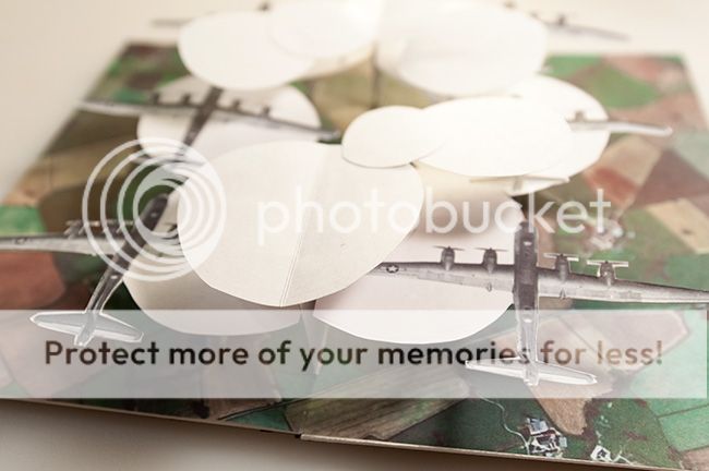
I guess I really wanted to use a transparent layer for the airplanes.
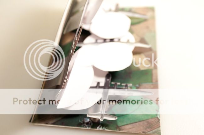
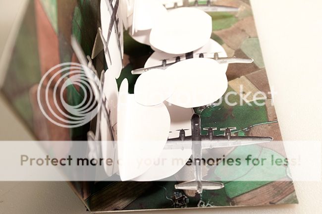
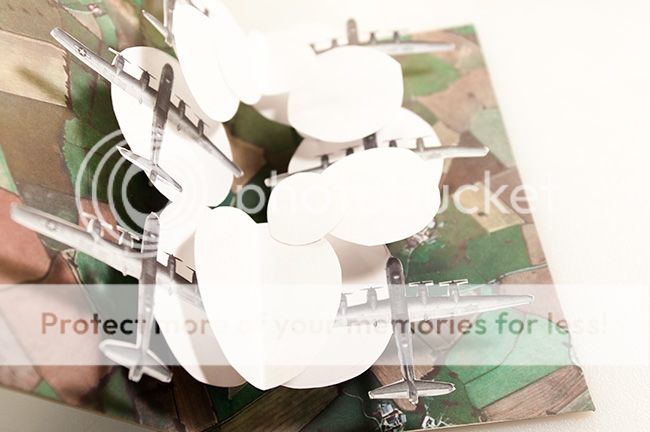
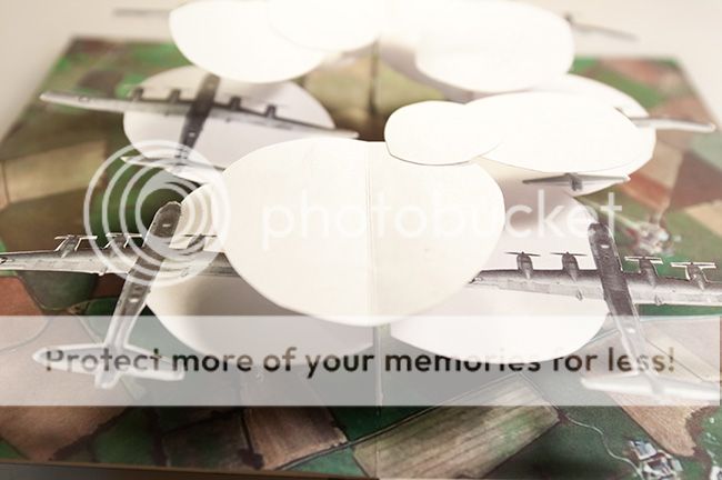
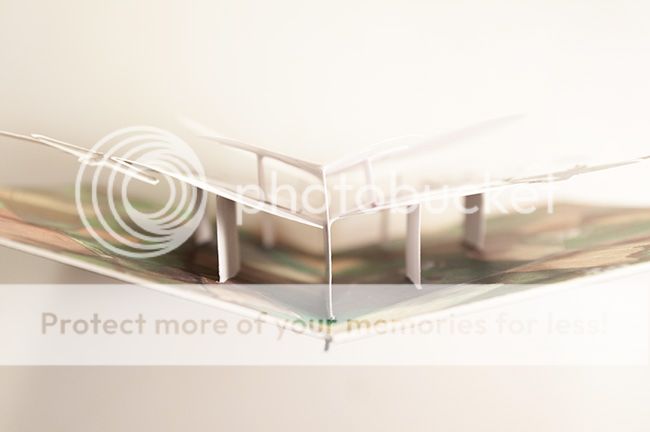
The idea is for circular clouds to substitute for a transparent layer. Originally I planed three layers of clouds, the center layer to carry the planes, all that without obscuring the quilt work landscape too much. That did not work so well within the restrictions, 1/2 inch elevation too low for a layer of clouds, so 1" the lowest cloud level and that carries the six planes. With a minor level of clouds above the planes in areas already obscuring the landscape.
But now circular like that looks like antiaircraft fire, and that's fine with me.
I want to try it again with different planes, or maybe with human forms like the Muse album cover. I like the idea. This falls short of my vision.
We artist-types talk like that, suggesting we visualize things better than we do. It looked better in my head.
Psych. It was an experiment all along.


7 comments:
Mighty good for a first attempt.
Have you considered sepia tone for the clouds to make it look vintage like the planes while also having some see thru visibility capability.
I used to use sepia, way back, to make copies of originals. the idea was to make those sepia copies original... as it were.
I mean there was only one original... the one that felt the push of the drafting pen on its pristine surface.
I'm talking about the days before the computer did away with all that.
Sepia tone would make it look like its been siting on some attic since the war.
Pretty cool for an experiment. How about clear plastic with wispy cotton glued on it?
No! Wispy cotton stiffened with glue.
Deb, that's a good idea.
Post a Comment