The issue has to do with food stylists and food photography.
Noticed first at Instapundit where their own favorite framing is "Leftist Autophagy" because Ed and Glenn like using words for repeated themes that their readers must look up. SJWs Melt Down Over “Racist” New York Times Chopsticks Photo. The revolution eats its own – while haggling over the inherent racism of the “wrong” chopsticks placement.
Nobody melted down. Nobody ate their own. They simply pointed out the thing that is wrong, as you do, knowledgeable to unknowledgeable. It's how we grow.
Then Breitbart: ‘New York Times’ Criticized for ‘Cultural Insensitivity’ with Chopsticks Photo in Restaurant Review.
And other places as well. The story is indicative of a presumed slow burning culture war.
Another PJ media writer characterized it as 'first world problem."
Right side commenters to the articles about this have no patience for any of it. Their reaction to the Leftish reaction to the photo is hostile.
The Twitter remarks commenting on the photograph all seemed sensible to me. That is, although they're being harshly criticized for being so anal retentive, it really is silly placement of chopsticks. It's actually funny. I'm an old man. As such I see young people do stupid things all the time and it's funny when it's coming from inexperience. Young people without world knowledge but doing things slightly beyond their reach crack me up because their mistakes come from not knowing. It's one reason why young people are so delightful and so endearing. Young people teaching other young people is endearing. Not annoying.
It's why the people at the tattoo shop who put up the sign in Five Points, Denver, "Proudly gentrifying the neighborhood since 2015" were so immediately funny. They were saying their tattoo shop classes up the whole neighborhood (it doesn't, because it cannot). It's just so stupid. The kind that comes from inexperience. They didn't know the word "gentrifying" is so touchy. They don't know it's a charge that applies to white people. Plus just imagining themselves gentrifying anything is itself very funny.
Same thing with these chopsticks. You don't just poke the chopstick anywhere willy nilly wherever you think two angular sticks will help your composition. Whoever did this layout never used chopsticks. Most likely but not necessarily a young person. And it's funny.
And that's all that it is. Funny. Pure and simple. There is nothing SJW about it. And learning what's wrong with the photo is part of growing up. To defend by saying that it's Asian inspired compounds the ridiculousness because Asian is too broad an inspiration and it is not inspired.
Why would the food stylist arrange the sticks as jabbing Vs? Why would they place a pair of chopsticks on a steak? Chopsticks are not held like that and they're not placed like that for service nor during use. A single diner wouldn't use two pairs of chopsticks in any one meal. It's a ridiculous arrangement set up by a child. And knowing that it comes from not knowing is funny.
This is what the food stylist was thinking:
Let's become food stylists ourselves and analyze the photo. Come on, for fun.
With my own photos in mind, I get bummed out when all the food is brown and the photo has insufficient color. I'm tempted to toss in something colorful simply for color. Those sepia-like photos, or monotone photos are not interesting. My chief critique here is with color. This is two-tone, brown and dull red and it is not an interesting photo. It is not an interesting meal.
The composition is fine. The trapezoid shape on the diagonal with the red seating around it is excellent. The circles and ovals set amid geometric angles is fine. The odd number count of items is fine, five steamed buns, three tamale-looking things is fine. The point of view from standing well above the table, higher than a tall man, gets in all the food items along with the bamboo steamers along with the seating, but not all of the table, and all the food items are in focus. All of that is fine.
Maybe lower would be better, with p.o.v of a seated diner, or the view of a waiter, with some of the items out of focus and with more of the food filling the frame and less of the bamboo steamers and seating.
It does not look like an interesting meal and it does not look like anything I'd get in a Japanese or Chinese or Korean or Vietnamese restaurant. Their steaks are served pre-sliced because... chopsticks. And it will never be a single unadorned steak on a plate. There will always be something else to make the presentation on the plate interesting, a single slab of meat is just so American, if only slivers of green onion cut on the diagonal, or a mushroom, or a tuft of microgreens. Asian-inspired food is more picturesque than this. It's more colorful. It's served that way so no food stylizing is necessary.
I can prove it.
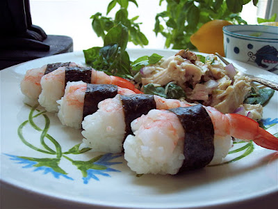
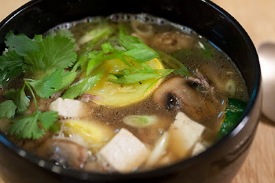
On my own site, a short happy trip to Domo Restaurant a few blocks away. This is becoming a standard Denver go-to destination due to the owners interest in authentic Japanese farmhouse style and his interest in classical Japanese gardening. His discipline is from running the dojo and his employees are trained accordingly. This is what Japanese inspired food really looks like. There is no photographic food styling here. It comes pre-styled. It's how they prepare it and it's how they set the table. Not me.
My own at home. Sixty-two photos follow.


6 comments:
A hot bowl of brothy noodles on a cold day... mmmmmm. Spoon please.
Obligatory Seinfeld
Angry Middle Eastern men become "Asian" when the hack-D press need to trixy over the terror.
Is that a steak (in the top photo)? How do you eat a steak with chopsticks?
ric, you just poke the steak w/ a chop stick and gnaw on it like a hillbilly.
That's what's so stupid about it. They didn't think about that.
Maybe a certain kind of stake can also double as 🥁 drums...
Post a Comment