This year, both campaigns
have decided to go Big, Fat and Sans-Serif. Brutalist, to
borrow a buzz-word from architecture.
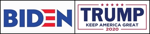
As for "design,"
the Biden folks did that cute thing with the cap E, which forces you
to stop reading, go back and figure out what it's supposed to be. I
guess if you're a Design Firm you have to do something design-y to
justify getting paid the big bucks. Me, I just find it irritating.
The Trump people didn't attempt anything that could be described,
even charitably, as "design.'
The Biden logo's message
is "Hey, at least we're trying." The Trump logo's message is
"Where's that intern who knows how to use QuarkExpress? We need
a logo and we need
it now."
it now."
In my opinion, the two
Obama campaigns did much better:

There's that nice
red-and-white swoosh-in-a-circle; it's pleasing, doesn't get in the
way of the text, and is a useful graphic element to tie all the
campaign materials together. Also, the type isn't all
Super-Extra-Heavy Bold, and has some serif and slab-serif fonts mixed
in, for a friendlier overall look.
What effect does all this
have in the real world? My guess is it doesn't shift a single,
solitary vote.
solitary vote.
I'm reminded of when our
local NBC affiliate spent, I think it was a quarter-million dollars,
on a new logo, and wound up with this:

It looks like a stylized
figure of a guy taking a dump.
