2) Open "Layers" from Photoshop menu.
3) In Layer subwindow, double click on original layer to unlock the layer to make it an ordinary fully workable layer
4) Duplicate the image. The duplicated image is automatically the active layer. Make adjustments to the new layer using photoshop tools. Everything little thing you do requires you to pick up a tool and tell the tool exactly what to do, what shape, size, pressure, fuzzy edges all that you must be very specific with each tool. And you must keep it nearby to go back and forth constantly picking up a new tool just as if you were making a pop-up card and have to constantly switch between scorer and blade and pencil and glue.
For the eye, I copied half for an eye lid, pasted into a new layer, flipped it so the leaf-lashes are downward, painted it white, then took chunks from the original for its dotted texture and discoloration. I could have cloned, I could have created a pattern stamp, Any number of things, but selecting a piece that I like and duplicating it and moving the new layer that contains the tiny patch to a new spot paste/move, paste/move, paste/move over and over until the area is filled up to 16 new patch layers, then compressed down to one layer, all for an eyelid, actually works for me faster than any of those other ways to do the same or similar thing.
The layers window can be closed at this point, so can tools, but I like to keep them opened because I often run something, back out to an earlier point and change it.
In my copy of Photoshop 7, I think, "timeline" is the word they use for the "windows" subwindow to replace "animation"
This is where Photoshop becomes a bit like a game with its Easter eggs and concealed treasures, you click on an unobtrusive corner you would take as mere corner-design and bang a another whole menu of wonderful splendid choices appears offering untold new possibilities. Surely you've discovered a secret room. Or perhaps Googled [photoshop animation]
The following shows what the windows look like when you find them. For a simple back and forth animation, the most boring dummkopfery kind. One I did today for another site, I thought, eh, what the heck, why not show it? If you care to continue, it's all screenshots of that.
These should click to larger if you like.
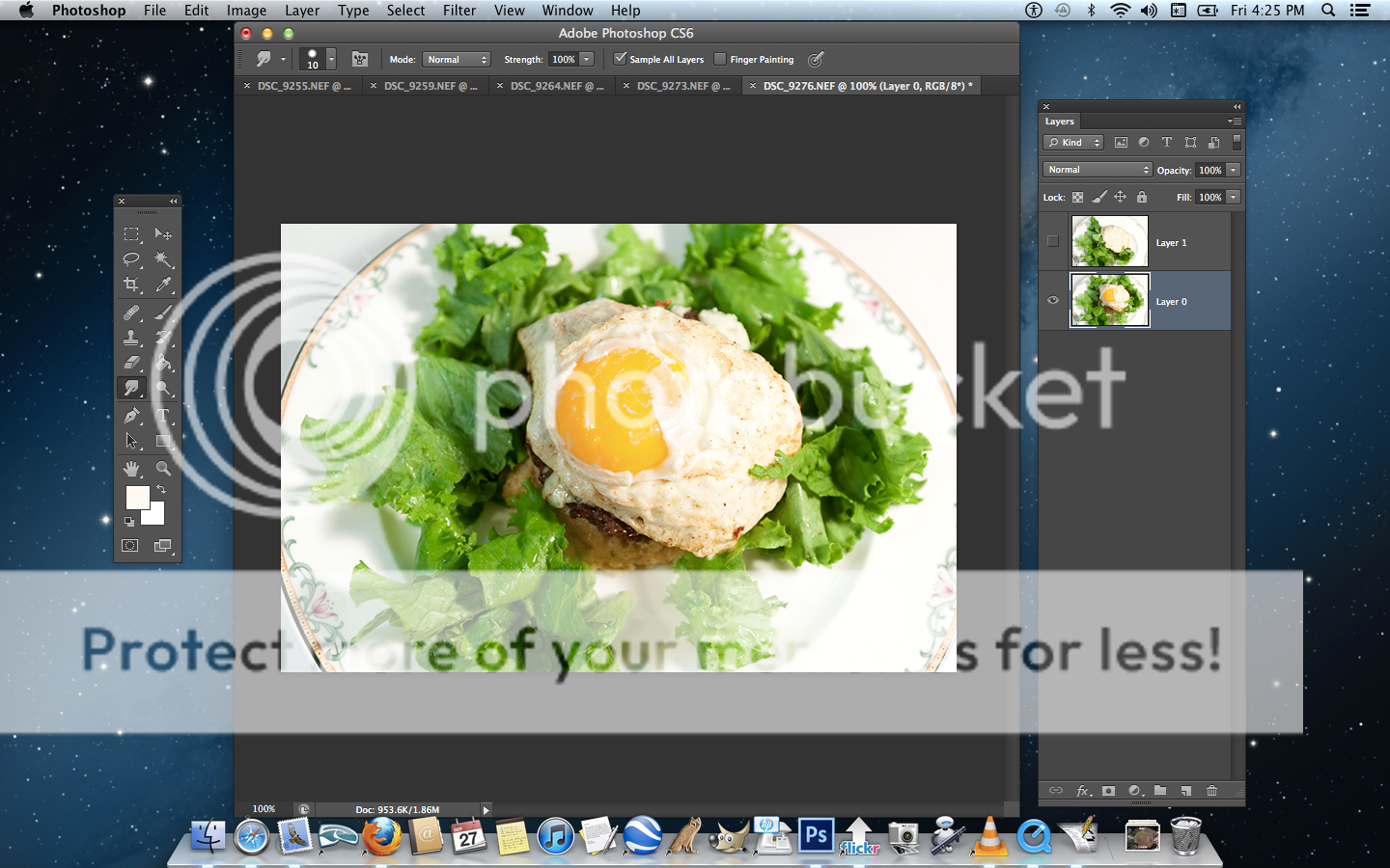
1) Original large photo in the center. Layers is open original layer active, Eye on, so that layer is showing. Tools on the left.
The second layer is already adjusted seen in the tiny upermost thumbnail. The eyelid already duplicated, flipped, the vacated area replaced. The second layer is not active, not lit up, not displaying, except for the thumbnail in the layers sub window. But it is still there and still ready to go. That is the thing about Photoshop, you must constantly tell it which layer you are working on.
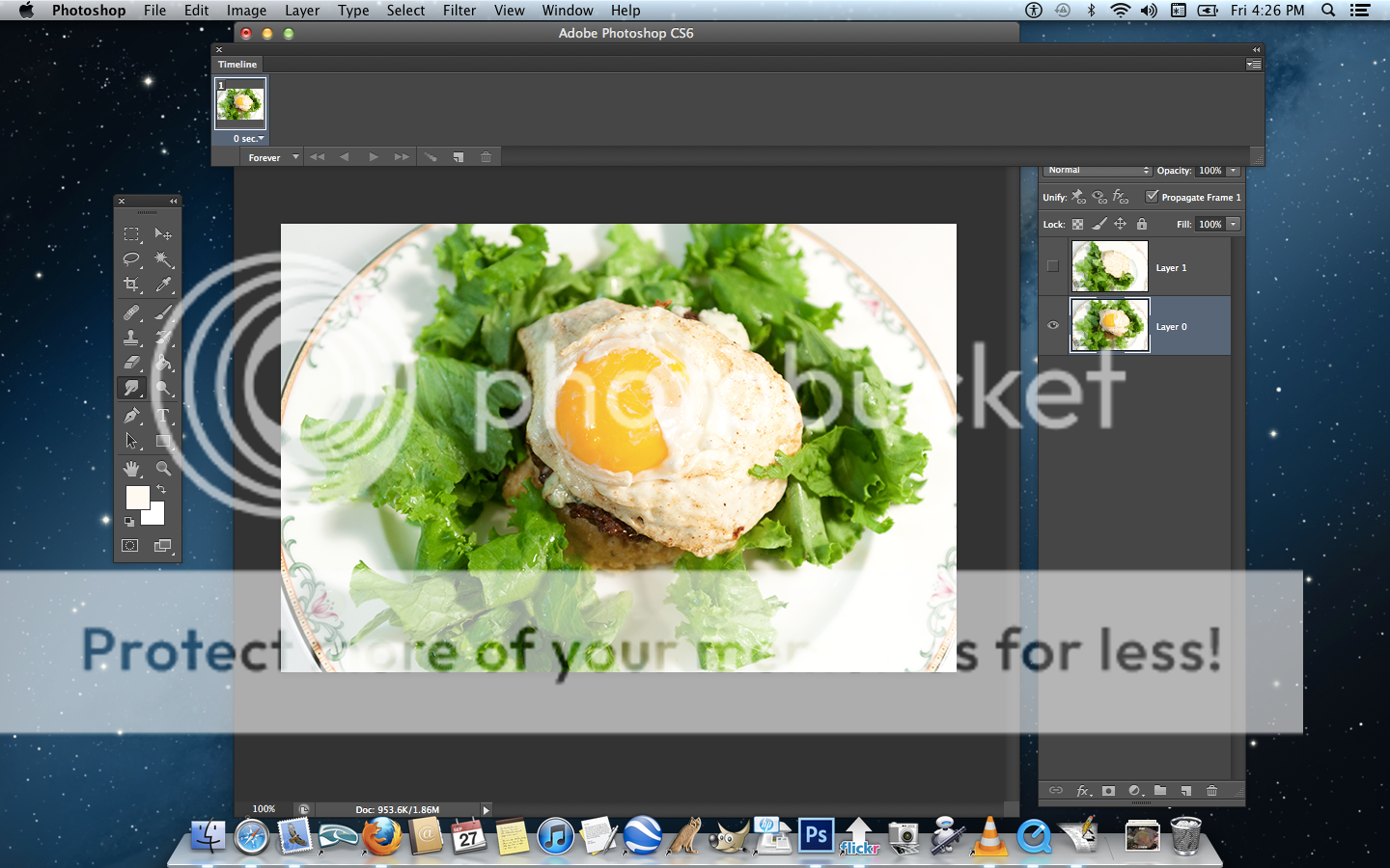
2) From the windows button on menu bar, timeline is selected and opens spread across the bottom of the screen or across the top of the screen as here, move the whole thing where you wish. Only one layer is showing. So far, timeline is aware of only one layer.
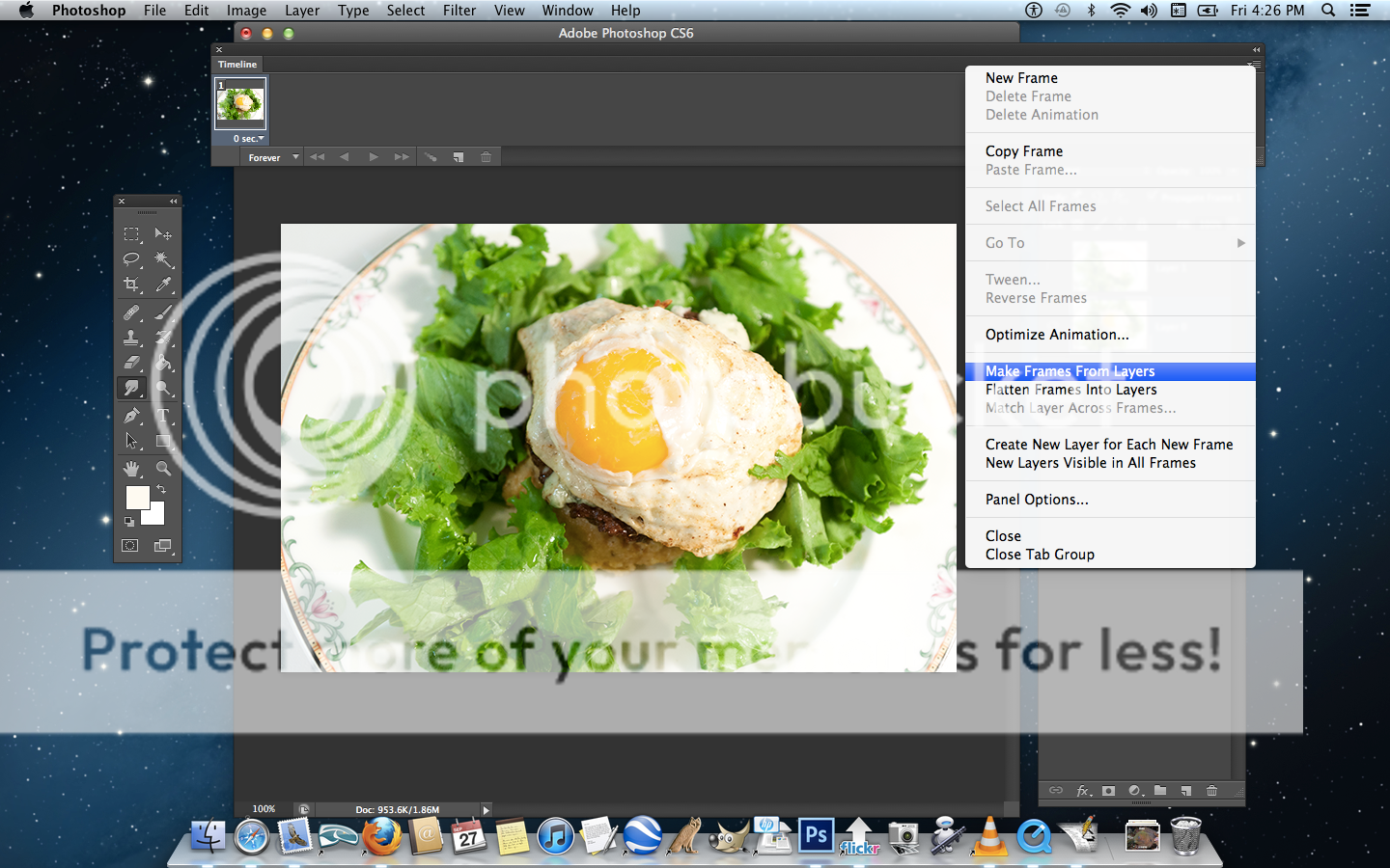
This is where Photoshop becomes a game. In the tipsy-topsy uppermost corner on the far right side of the new timeline window you just now opened is a small stack of parallel lines, that is the button that offers the animation menu. It is tiny, it is color one tone off, disguised, or perhaps merely subtle. Choose "make frames from layers" from the menu. All the layers stacked up like a ladder down there, here only two, in the Golden Slumbers asl translation 150 frame for that, it makes no difference to Photoshop.
4) Oops. Same as three.
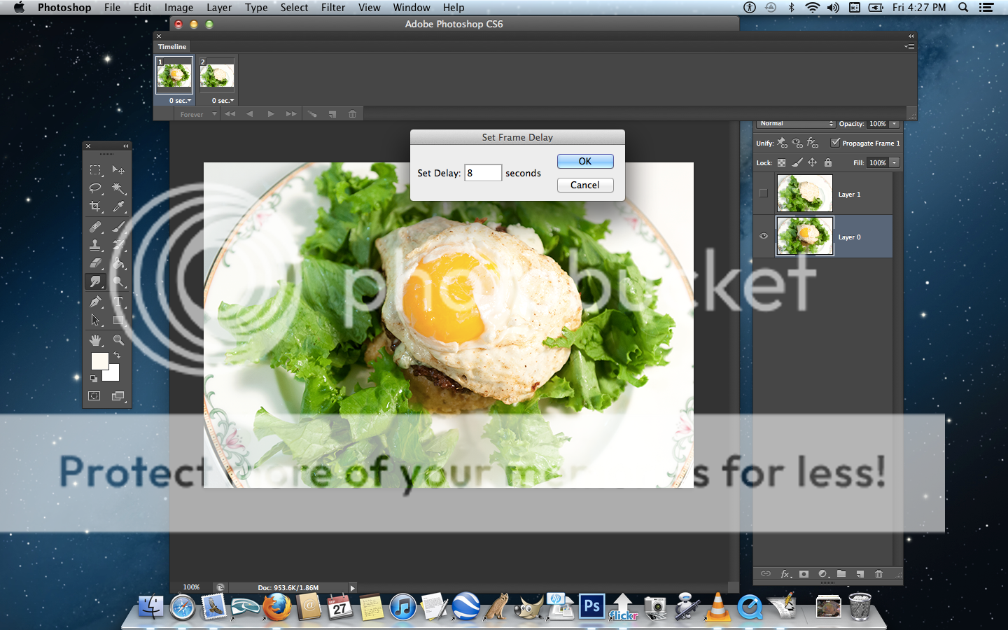
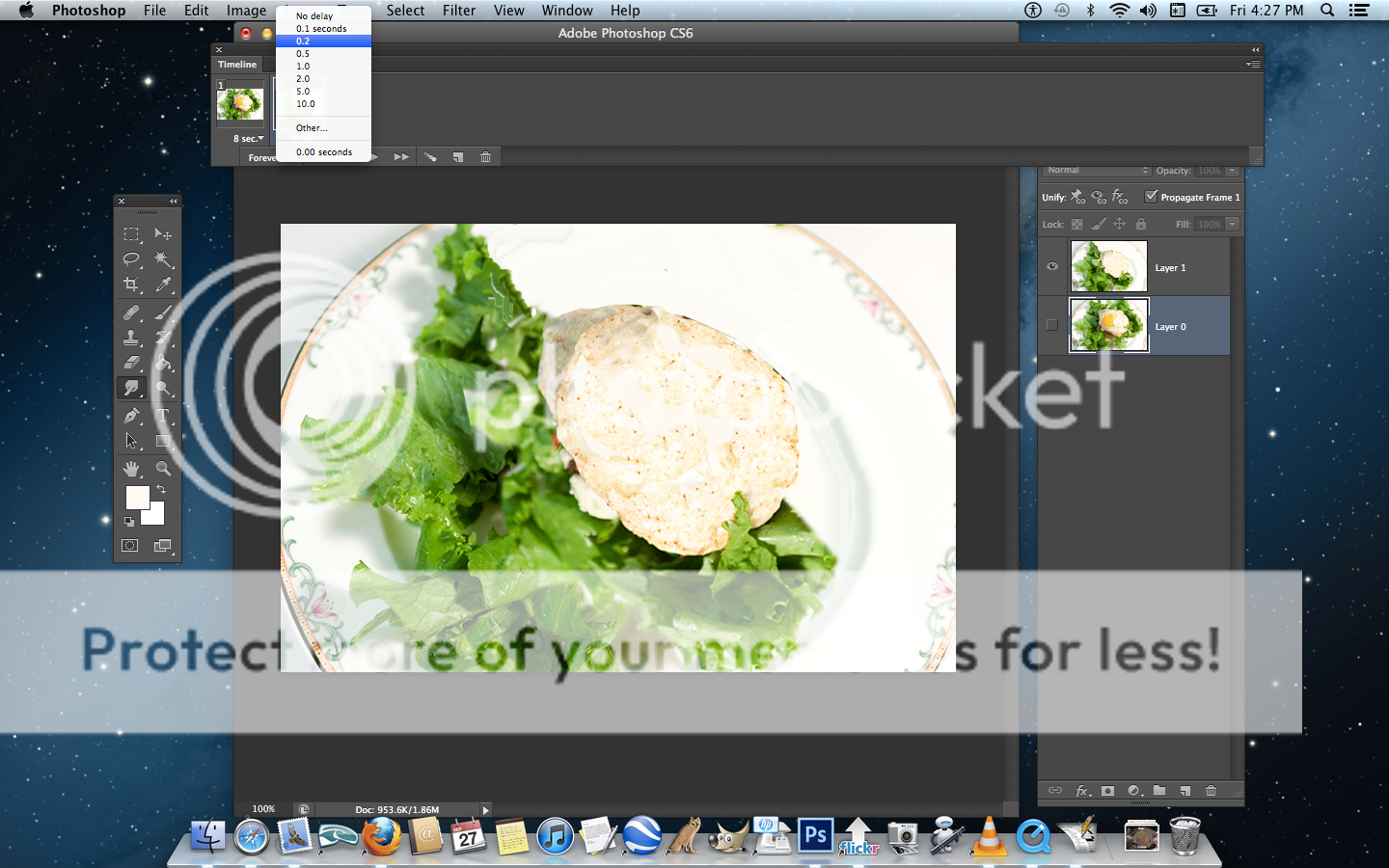
5) The time for each individual frame is stated explicitly. Each frame has a button to click, a new interactive menu opens, you tell it the exact time to show. Or else choose from a list of useful appropriate times. You have a much broader range available.
This is the total drag of animations when there are a lot of frames. I mean it. Each frame, click, paste time or type it or choose, click, click, click, click working your way across the time line bar. I always miss one or two because my screen is tiny then it runs oddly.
When my brother saw this he was appalled, flipped out, "Naaaaaah, no way, Dude, you have to be kidding me. No. No. No. No way, You have to do that in Automator or something."
Believe me, Doood, I tried.
The free program GIMP does not do this. In Gimp, the file is not saved as GIF to turn it into animation as here in Photoshop. It's different. In GIMP animations are created by exporting as GIF and it asks you what time to set for the frames and it asks if that is for all frames. It's worth getting and having just for that. So that it sets the time for all frames in an animation for you instead of click, click, click, a hundred times. That is what I did with the asl translation 150 frame gif.
6) At the timeline choosing .2 seconds from its list
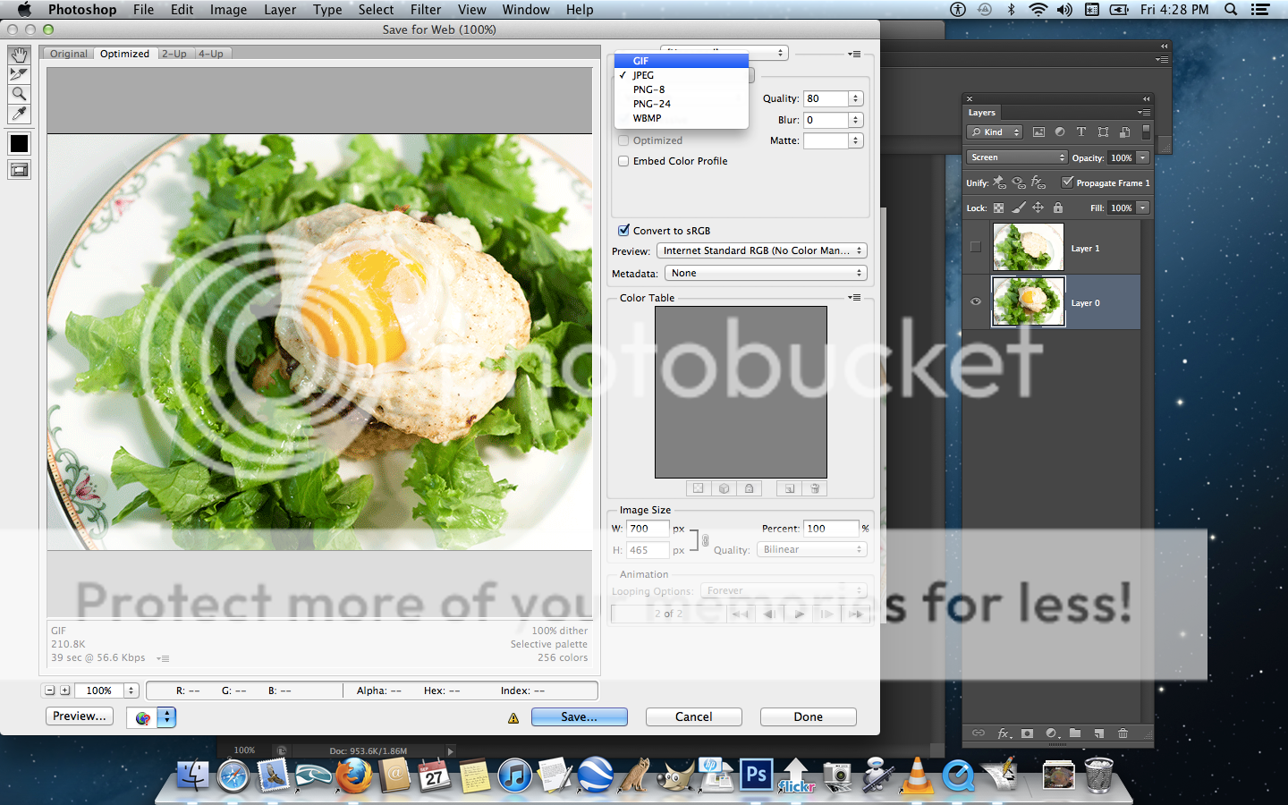
Saving is where Photoshop turns it into a file that runs as animation. It is a file where frames share information. The more information that is shared, the smaller the file size. But that is already determined at this point by the changes you made to the frames. The less changes you made to the lest area the better for file-size-conservation optimization.
File dimensions can also be changed here. This one is large, 700px width, usually they are no more than 400px for the same reason of file-size-conservation.
There is also the number of colors. The more the better, up to 256, but also the more complex obviously and higher file size. Increments are offered but you can tell it exactly how many colors to use even which exact colors if you like. This is maximum 256 colors and large dimensions.
Complexity of image also affects file size due to it calculating by entire lines. If a whole line is one color that is one calculation rather than thousands as it reads across the line.
Saving is where GIMP turn it into animation too, but there the file is exported and not saved. Same thing, 'cept differn't.
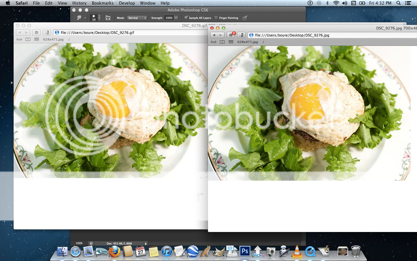
8) Here I am comparing, GIF on the left, JPG on the right. The image I started with is more brilliant than both these showing clearly in preview. I am always disappointed in what is lost. Previewing the GIF by itself I discard the whole idea. I don't like it at all, the yellow gradient in the yolk shows too distinctively. Too much is lost. But then the JPG is not much better. I keep it. It blinks on the site. I hate myself.
6 comments:
Excellent! I've long been interested by never willing to wade into a long lesson. This is a perfect length and now I'm on the animated GIF train! Well, once I have time again, which I haven't for a while... I should animate my blogging is what I should animate. Any lessons for that?
Trooper has a unique logo, that pollo came up for him. A unique logo for this blog would be nice.
I'm also going back to the old Levity name.
Comment Home is just wrong... presumptuous, childish.
(bad link)
I did a couple for my brother and he never uses them. I cannot imagine why. He had a site that sold such things.
Before that he owned a coffee shop called Annabelle's. Didn't use that either.
Always up to something and dragging me into it.
Then the sixth time I go, "That's interesting. Do I look like your own personal logo Photoshopping bitch to you? I meant just now to say, what do you have in mind?"
That was a thing then, the British lads picked up from the Yanks and I picked up from them. They said it at least a dozen times. They waited for the chance then pounced when it's given, it delighted them to act like Americans in the movies. In response to a slew of people who would drop in with suggestions. That was kind of odd. The last one I recall was a teenager from the US who had ideas for pimping out his school bus. He had all kind of ideas to pimp it out and was looking for help and not getting any. At all. Nobody was interested. He was met rudely too with, "What do we look like, bus-pimping out Photoshopping bitches to you?" Whereupon we'd all burst out laughing privately but not showing it publicly and we still do find that hilarious. Because it's so flat and so rude and unhelpful and don't bother me. Then, still there hanging around or gone in disgust, there follows a full thread of busses already pimped out, military tanks pimped out in pink, mini vans pimped out, compact cars pimped out, motorcycles pimped out, scooters pimped out, bicycles, tricycles, you name it, already done, it's a favorite theme actually. All he had to do was use site search and he'd have one.
I don't know, I don't have anything in particular in mind, with respect to a logo.
Comment Levity Logo contest!
With prizes!
Post a Comment